Typeface Exploration
Typeface Exploration —
Client:
Personal Project
Typefaces:
1. Amapola / 2. Magna / 3. Sagrada (All unreleased...for now).
This is a collection of typographic personal projects that aim to blur the boundaries between art and design. Crafted by experimentation: Amapola, Magna and Sagrada are expressive systems designed to leave a mark on the text with a unique voice.
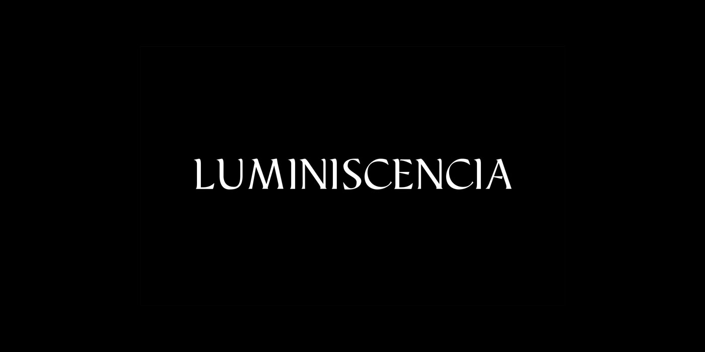
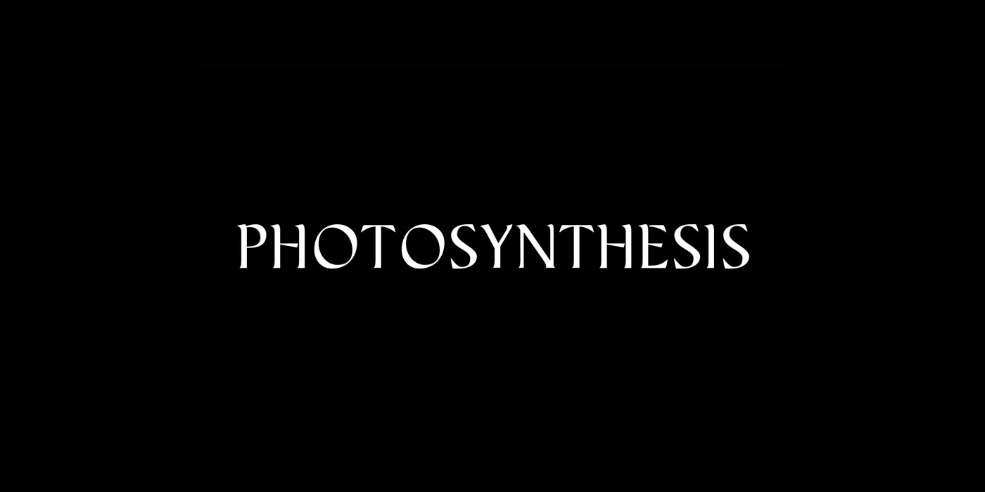
*** Amapola (Papaver somniferum), named after the Poppy or Opium, is a radical and playful display typeface that showcase a high x-height, ultra condensed spacing and a thin body. For Amapola, Visual Expression beats legibility.
*** Magna, is a high contrast humanist typeface based on calligraphy. As a really early stage on my typeface studies, Magna was intended to be true to the relationship between hand and brush but after much consideration, the personality of the font is centered in the happy 'mistakes' that live within it.
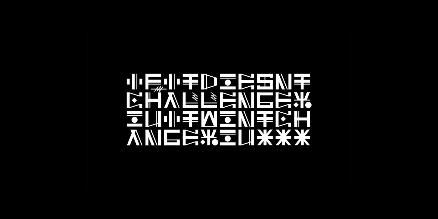
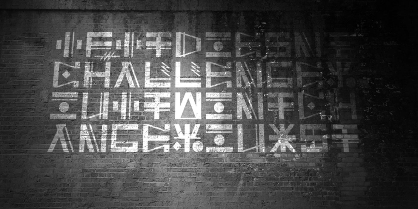
*** Sagrada (Sacred), is a personal take on a typographic modular system for massive sizes. Based on stencil and inspired by projection mapping, this system challenges readability as some of the strokes used for the letter architecture just play an aesthetic role and are intended to trick the eye.
This is a collection of typographic personal projects that aim to blur the boundaries between art and design. Crafted by experimentation: Amapola, Magna and Sagrada are expressive systems designed to leave a mark on the text with a unique voice.
*** Amapola (Papaver somniferum), named after the Poppy or Opium, is a radical and playful display typeface that showcase a high x-height, ultra condensed spacing and a thin body. For Amapola, Visual Expression beats legibility.
*** Magna, is a high contrast humanist typeface based on calligraphy. As a really early stage on my typeface studies, Magna was intended to be true to the relationship between hand and brush but after much consideration, the personality of the font is centered in the happy 'mistakes' that live within it.
*** Sagrada (Sacred), is a personal take on a typographic modular system for massive sizes. Based on stencil and inspired by projection mapping, this system challenges readability as some of the strokes used for the letter architecture just play an aesthetic role and are intended to trick the eye.
![[ST]typefaces_3](http://santiagotor.com/wp-content/uploads/2019/05/STtypefaces_3.jpg)
![[ST]typefaces_2](http://santiagotor.com/wp-content/uploads/2019/05/STtypefaces_2.jpg)
![[ST]typefaces_5](http://santiagotor.com/wp-content/uploads/2019/05/STtypefaces_5.jpg)
![[ST]typefaces_6](http://santiagotor.com/wp-content/uploads/2019/05/STtypefaces_6.jpg)
![[ST]contenido_magna](http://santiagotor.com/wp-content/uploads/2019/05/STcontenido_magna.jpg)

santiagotor.acos@gmail.com
Montreal, Quebec
santiagotor.acos@gmail.com
Montreal, Quebec
santiagotor.acos@gmail.com
Montreal, Quebec
All Rights Reserved
© 2019 Santiago Torres Acosta
All Rights Reserved
© 2019 Santiago Torres Acosta
All Rights Reserved
© 2019 Santiago Torres Acosta
All Rights Reserved
© 2019 Santiago Torres Acosta
All Rights Reserved
© 2019 Santiago Torres Acosta